The Jersey Reveal
We are really excited to finally reveal the 2019 CRCA Jamison Bear Mountain Classic Winners Jerseys. Hope you love GIANT MONSTER BEARS!
Just kidding…
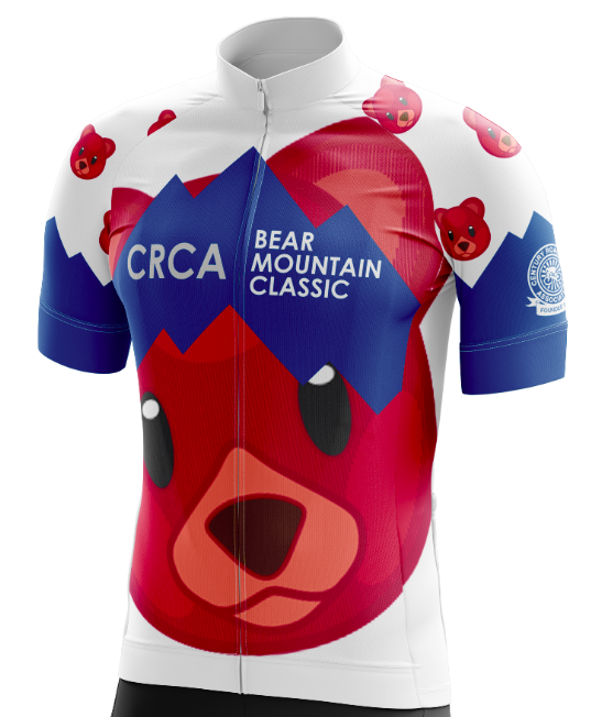
Last month, when chatting with Phil Castaldi, of Lucarelli & Castaldi, Phil suggested reintroducing a King/Queen of the Mountain competition as a way to make the race more vibrant and exciting. We agreed, and with Lucarelli & Castaldi’s generous backing, we decided to make KOM/QOM Jerseys as a special keepsake award for the racers. The Bear-a-DotsTM pattern had been an idea swirling in my head for a while now, and this was the perfect opportunity to bring it to life!
We put a call out for a jersey designer on our CRCA Members Facebook Group, and Alex Klafehn was the first to reach out. When Alex executed our vision perfectly and at record speed, we couldn’t help but ask him to do a couple more. The result of this collaboration is a set of one of a kind Winner’s Jerseys for this year’s edition of the CRCA Jamison Bear Mountain Classic. If you didn’t have a reason to register for this race before, here are a few more:
BUT, we couldn’t let the winners have all the fun. So, we also created a Fan Jersey and Socks for anyone to purchase! Pre-order yours on bikereg.
In addition to being a talented designer and an extremely organized and professional collaborator, Alex is also quite funny. Read how the design process played out in his words below.
On behalf of the CRCA Board and the eventual owners of these jerseys, thanks for all your hard work, Alex! And, of course, none of this would be possible without out our title sponsor, Stephen Jamison and KOM/QOM competition sponsor, Lucarelli & Castaldi.
CRCA JAMISON BEAR MOUNTAIN CLASSIC: A Tale of Four Jerseys
FIRST UP THE HILL
The first jersey that was designed was the KOM/QOM design. Lucia provided a fairly simple brief:
create a jersey design reminiscent of the classic polka-dot KOM of the Tour de France
use the iOS bear emoji for the polka dots
end of brief
Tracing the iOS emoji is simple, but as it turns out, emojis are copyrighted! Since I didn’t want CRCA to be haunted by the vengeful ghost of Steve Jobs, slight adjustments were made so as to remain recognizable as an emoji/icon but different enough to firmly land outside of the courts.
The next design issue to tackle was the text & logo placement; as a way to shift the bear-a-dot/polka-bear pattern around without linking it specifically to the text or logo placement, a background stripe was put down for the logos to sit on, then given a couple kinks so as to emulate a set of abstracted mountain peaks.
As with all design work, it’s an iterative process — version one was brown bear emoji vs KOM red bear emoji. The stripe was deemed a bit too abstract, so on the next version (strawbeary-banana vs bluebeary; I leaned hard into the stupid pun nicknames here) a second set of “mountain peaks” were added via negative space. We moved forward with bluebeary, and with some minor tweaks to the design, got to the finished product.
WE’RE NOT LOST, MY JERSEY IS A MAP
With the relative success of the KOM/QOM jersey, we decided to come up with a winner’s jersey for the event as well. Two designs were produced: Charlie Brown, GC Contender and We’re Not Lost, My Jersey is a Map.
Charlie Brown, GC Contender took the abstracted set of mountain peak stripes and extended that motif throughout the entire front and back panel of the jersey, creating essentially a simplistic landscape painting of Harriman State Park. However, I noticed that the peaks created a zig-zag not unlike the shirt that Charlie Brown wears and from then on I have been completely unable to un-see it.
The second option went back to the KOM/QOM jersey motif — a blue stripe over a base pattern. As a way to tie the design to the event & location, topographical data of Harriman State Park was downloaded from the USGS and stripped of all non contour lines to form the textured pattern of the jersey. It’s not important to the design, but it’s important to me that you know that of course the USGS topo grid was split right across the middle of Bear Mountain, which meant I had to spend an extra hour stitching two topo maps together in CAD because they didn’t line up properly. The sacrifices we make in pursuit of an idea.
I CAN’T BE-LEAF IT
To complete the set, a green sprint leader’s jersey needed to be made. Inspiration for this was rather lacking — it turns out pro-level leader’s jerseys are pretty much just “green jersey with a bunch of logos haphazardly slapped on top.” So, I returned to Bear Mountain for inspiration (not literally, it was still cold as hell) and did some research on the park. One thing that caught my eye was a report on NY state parks; apparently Harriman is home of one of the largest old-growth chestnut oak forests in the area. Some of the trees out there are 300-500 years old! It seemed fitting then to trace the chestnut oak leaf and create a giant leaf pile pattern as the base texture of the kit.
BEARS FOR EVERYONE
The final challenge was creating fan merch for the event. We needed a design that was similar enough to the KOM jersey to be a clear relative, but unique enough to have its own personal identity. The first three attempts seemed a little too distinct — instead, we went for a quick sketch that I mocked up using a blend of the KOM jersey with one of those previous attempts.
This sketch added a few more abstracted mountain stripes to the front/back panels, as well as a couple more on the sleeve edges. Still a little too close the original, we removed the blue on one sleeve, creating an asymmetric overall design that separates itself from the symmetric leader’s jerseys.
If jerseys aren’t your thing, then we still have you covered! A sock design was added to the brief, and while the basic concept was super easy (put bear-a-dots on socks and include CRCA somewhere on there), the actual execution was a bit trickier. Unlike jerseys, typical sock fabrics are a much rougher medium and it’s far more difficult to achieve the same level of detail in both. This called for a sock-friendly version of the bear pattern, scaled down in a way to be considerate of material restrictions as well as how they’d look when shrunk down to ~2cm size.
CRCA X LCD
Overall, each kit shares a unifying theme while having its own unique identity that lets it stand out on its own — I can’t wait to see them on the podium or chance upon them out on the road. I’m extremely proud of the designs we’ve put together for this event, and I’m grateful for the opportunity to help out CRCA in a way that utilizes my personal strengths.
If you would like to see more of my work, check out @lcdcustomcreative or keep an eye out for the LCD logo on kits coming out this year!

