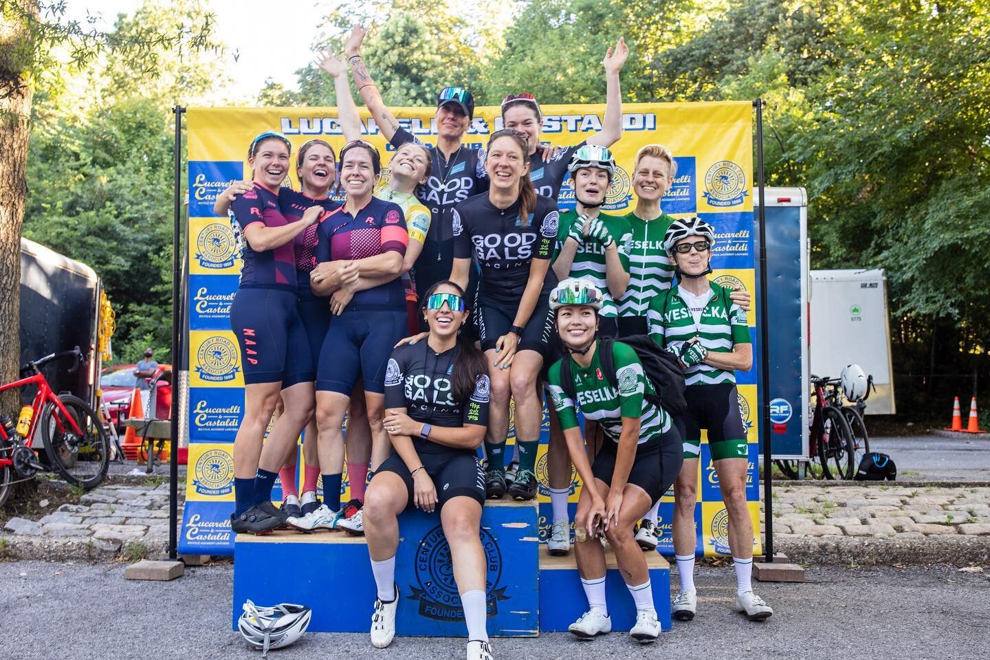
With just a few weeks until the first race of the season on March 1, we are thrilled to announce brand new leaders’ jerseys for the 2020 CRCA Lucarelli & Castaldi Club Series!
These jerseys were born from the generous support of our title sponsors Lucarelli & Castaldi and the dedication of Club Racing-extraordinaire Kevin Hseih. Designed by Alex Klafehn, who you might remember from our 2019 Bear Mountain Classic leaders’ jerseys, these colorful Hincapie Sportswear prizes will be hitting Central Park soon …or soon after the jackets come off!
Please read designer Alex Klafehn’s account of the entire design process below, and don’t forget to register for the season here.

Big Mood (Boards)
With a rather blank canvas at my disposal, I looked at CRCA as a club and the unique complexities to it for a compass heading to the design. I outlined a few basic requirements for myself:
The Club CRCA kit is already yellow; the leader’s kit should be easily distinguishable from it at all angles & contexts (the men’s B field can be a very confusing place, let me tell you)
CRCA represents a vast array of teams and thus team kit colors & designs; the jersey should feel mostly cohesive when paired with any number of bib colors or designs without resorting to making it all black and hoping Rapha doesn’t notice I stole their schtick
The design will be used for both men and women and ideally will be used for a number of years; it should be relatively evergreen (everyellow??)
While looking into ways to satisfy these requirements, CRCA’s use of #UnitedColorsofCRCA inspired me to look into the option of using a more diverse spectrum of colors for the kit. While the maillot jaune is a strong, established symbol of the leaders jersey, it’s not without precedence to use the rainbow stripes to denote the winner — Austin’s Driveway Series, arguably one of the best weekly race series in the US, uses non-standard RGB colorwheel kit to set themselves apart from the rest.

I was also taken by the look of textured geometric forms to gently pair with existing kits; as nothing will truly match every kit well with exception to the caveat mentioned in the second requirement above, I did want to avoid clashing textile patterns or plain blocks of color.

Parametric Programming as a Means to Inspire Design
...is the big nerd way of saying “I used some computer code to make this thing.” Parametric programming more specifically is creating geometries & forms using algorithms, rather than drawing lines or volumes. One of the interesting algorithms out there is a Voronoi diagram, which can be used in a number of fields but shows up quite a bit as a biological model for cellular structures. Since I wanted to create a textured geometric gradient, the Voronoi diagram seemed like an easy way to generate that.

Other than creating interesting patterns, one of the other strengths of parametric programming is that it requires relatively few changes to the input data to produce dramatically different forms. The three iterations below all use the same basic point grid base, but by applying different kinds of geometries to those points, three very different designs appear:

Ultimately we went with Iteration 1B; the yellow shoulders grounding the kit’s identity as a leader’s jersey but with the textured rainbow pattern firmly separating itself from any other design in the peloton.
The Devil is in the Details
One of the things I enjoy about kit design are all the meaningful considerations that can go into guiding a design. For example, the shoulders are the most visible part of a rider from within a peloton or when viewed from the front — so making those yellow makes it easy for quick identification by their fellow riders, spectators, and photographers on the sidelines (you’re welcome, Bicycle Racing Pictures).
I also wanted to add in a few smaller details to the kit to provide a sense of mindful intention; on the left cuff is an elevation profile of Central Park, with each of the traditional five finish locations marked by a black stripe. On the bottom left pocket is the hashtag that inspired the design, #UnitedColorsOfCRCA; the left pocket was chosen since we typically put our numbers on the right and I didn’t want it to get covered.


CRCA X LCD
If you would like to see more of my work, check out @lcdcustomcreative on Instagram or keep an eye out for the LCD logo on kits coming out this year!